Blog
Stay up to date on the newest developments on Veboli and get insights into the workings behind the screen.
Years
An even better design!
2015-07-30 14:51
Design 6.0 is finished! 5.0 definitely wasn't a bad design, but I didn't completely like the light gray background and orange boxes. So I decided to play with all the style rules. By changing the background to white I was all of a sudden in a fit of inspiration and quickly made all sorts of improvements.
You can see everything I've changed the best on the film page.
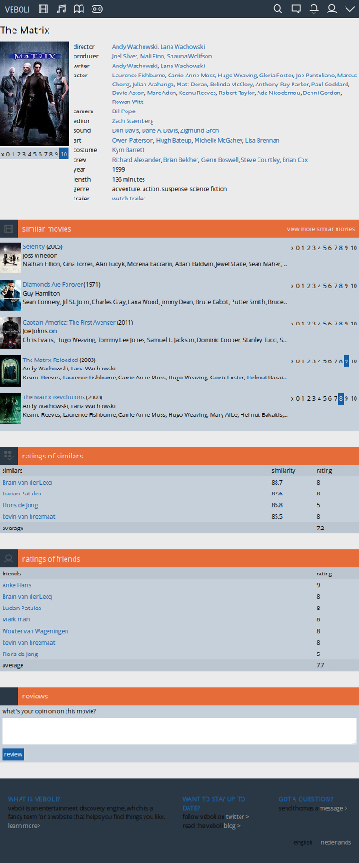
How the page used to look for The Matrix.
Light gray background, orange boxes with icons, and the old design for displaying your rating.
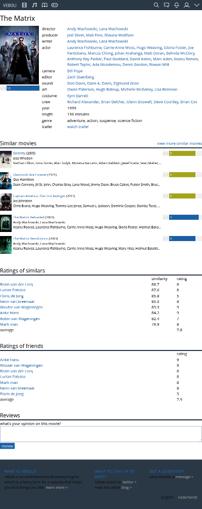
How the page for The Matrix now looks.
White background, a simple design for the boxes, and a clearer display of your rating. The degree of recommendation for the movies you haven't seen is now displayed (in yellow) everywhere, not just on the recommendations page.
What is Veboli?
Veboli provides personal movie advice, so you can easily choose the right movie to watch. Learn more
Read more about a subscription
Read the terms and conditions


Got a question?
Send us a message
English