Blog
Stay up to date on the newest developments on Veboli and get insights into the workings behind the screen.
Years
Design 15.0
2020-09-25 15:13
I think my heart was in the right place, but adding yellow was at most a lateral change. So I've spent the last couple months working on a pretty big overhaul of the design. I am quite satisfied and definitely think it's a big improvement. Feel free to let me know what you think!
The yellow's been removed to make room for a blue theme, the lists of movies (as on the ratings and recommendations pages) now have larger movie posters, and perhaps most important of all, rating, reviewing, and adding movies to your lists has been made easier by including the icons to do this whenever a movie is displayed.
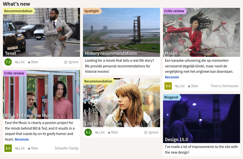
Two pages received major changes, the home page and the movie pages. Besides applying the new theme to the home page, I added a "What's new" section to show new blogposts, spotlighted features, new reviews, and new recommendations.

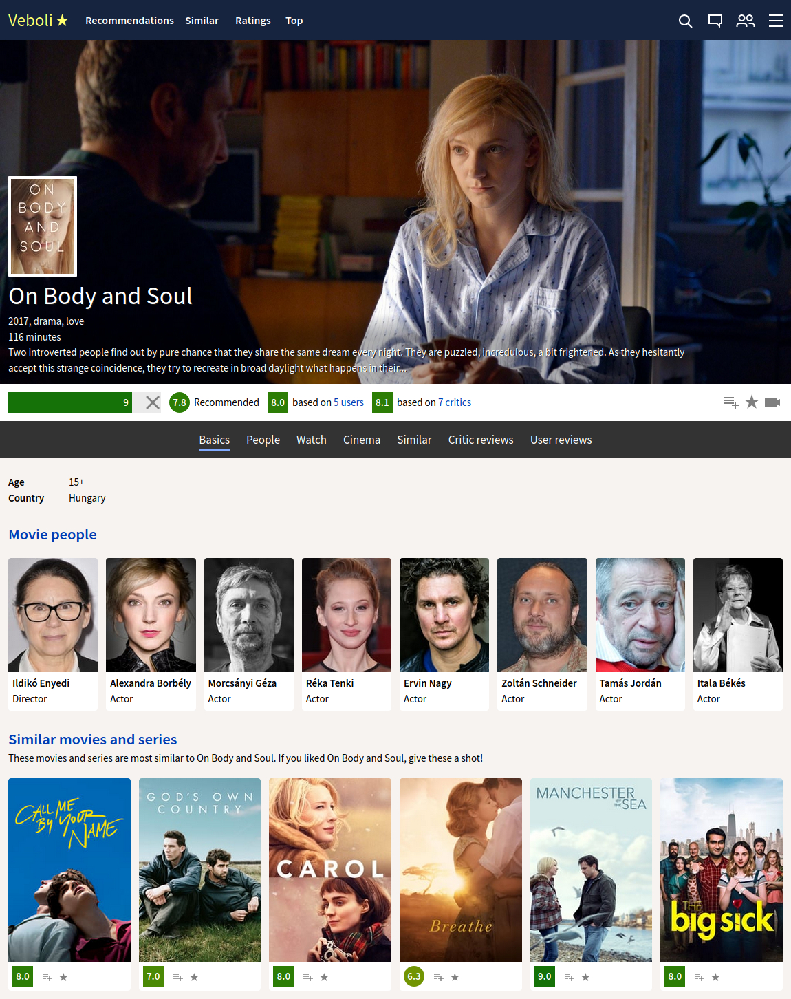
The movie page now has easy to navigate subpages: basics, people, watch, cinema, similar, critic reviews, and user reviews. Below is what that looks like for the great movie On Body and Soul.

I also removed the preview popup, you now go directly to the movie page when you click on the link.
Check out the post about design 14.0.
What is Veboli?
Veboli provides personal movie advice, so you can easily choose the right movie to watch. Learn more
Read more about a subscription
Read the terms and conditions
Stay up to date?
Read the Veboli blog
Got a question?
Send us a message
English


