Blog
Stay up to date on the newest developments on Veboli and get insights into the workings behind the screen.
Years
New design
2014-04-03 20:01
I've been working on design 3.0 the last three weeks. My plan of attack: how do I want everything to look? The difference with 2.0 is clearly visible in the starting page for when you are not logged in. Instead of saying everything with words, I now also use the layout, colors, and images to focus the attention on the right place and to convey the necessary information.
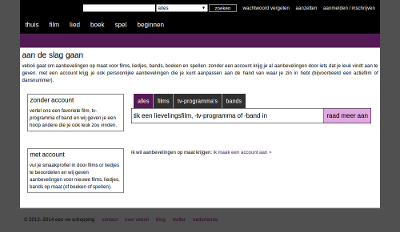
Design 2.0: a chaotic greeting.
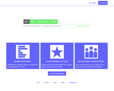
Design 3.0: a (hopefully) simpler and clearer greeting.
I thought it would we cool to look at how Veboli has changed over the years (by using my film ratings page as an example).
Design 0.0: on may 29th, 2012, Veboli went online with a sparse green design. I looked to Wikipedia to help help develop a sleek and simple design, but that wasn't such a good choice considering Wikipedia has lots of large chunks of text and Veboli is composed of small groups of words.
Design 1.0: at the end of october 2013 I started to clean up many of the scripts for Veboli. On october 25th, I also had a new blue design, drawing inspiration from the Movie Database (where Veboli also gets its movie data from). The content is now displayed in the middle of the browser, instead of to the left, and I made more use of lines and sections to organize things.
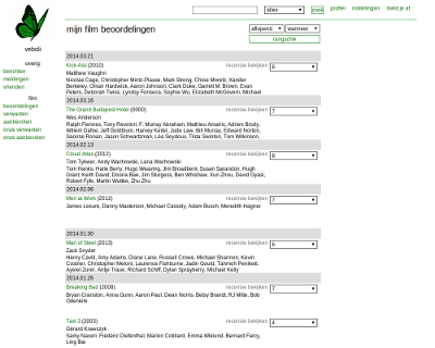
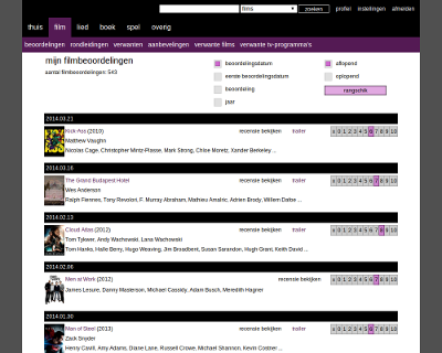
Design 2.0: despite having improved many things with design 1.0, I quickly got started on a new purple design that went live on december 9th. The left navigation bar (with links to movie ratings, song recommendations, etc.) Moved to the top and I paid attention to smaller details, such as the radio buttons and the way in which ratings are provided.
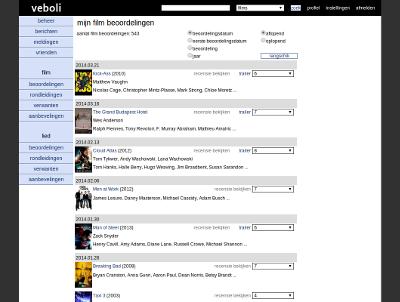
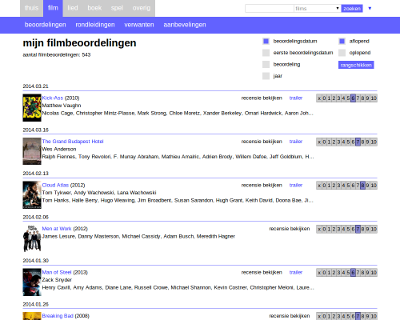
Design 3.0: since march 29th, 2014, Veboli is up and running with a sleek white and blue design, with green accents to emphasize the important parts. To find a good balance between minimalism and a clear and logical layout I looked at Dropbox, Codecademy and OKCupid. I also received a lot of help from Anke Hans. The navigation bar is more compact and I looked at many of the smaller details, such as the alignment of text and the style of buttons. What I personally like most is that the width of pages is now dynamically calculated based on the browser size. Currently it can shrink down to 500 pixels, but with some tinkering I hope to push this back to 320 pixels.
What is Veboli?
Veboli provides personal movie advice, so you can easily choose the right movie to watch. Learn more
Read more about a subscription
Read the terms and conditions


Got a question?
Send us a message
English