Blog
Blijf op de hoogte van de nieuwste ontwikkelingen op Veboli en krijg inzicht in hoe het achter de schermen in elkaar zit.
Jaren
Ontwerp 13.0
2018-04-15 13:19
Het is klaar! Ik heb een paar uur te veel gestopt in het nieuwe ontwerp de laatste tijd omdat ik het af wilde hebben voor mijn week bergwandelen in Zwitserland. Maar wat is het toch schitterend!
Veboli is niet het enige site op de Interneten dat ik gebruik en het lijkt erop dat ik wat ideeën heb verzameld de afgelopen weken en maanden. Toen ik begon te knutselen met de thuispagina als je ingelogd bent zag ik dat ik niet alleen aan een update werkte. Nee, nee, ik was begonnen aan het definitieve ontwerp voor Veboli!
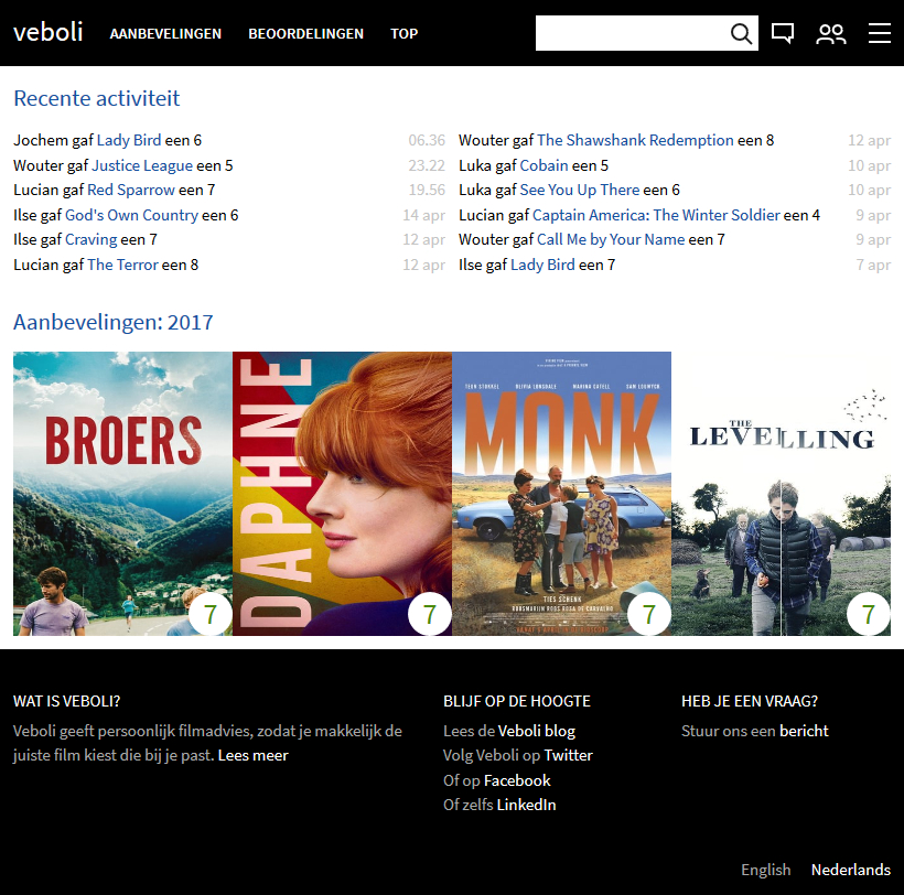
Een afgekorte versie van de thuispagina waar ik mee begon.
Zwart boven en onder, wit voor de inhoud, tekst voor de recente activiteit, en grote posters voor het weergeven van films.
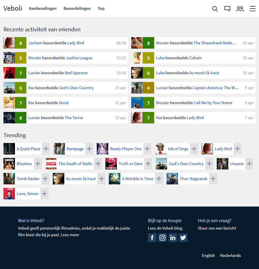
Hoe ik de thuispagina heb omgetoverd.
De eeste stap die ik nam was het weergeven van films met een horizontale balk. Dat is logischer voor tekst en schepte meer orde voor wanneer er een hele hoop films worden weergegeven (zoals je aanbevelingenpagina). Toen heb ik de specifieke aanbevelingen weggehaald en trending films toegevoegd. (Maak je geen zorgen, de specifieke aanbevelingen kan je nog terugvinden via de aanbevelingenmenu.)
Om het af te ronden is de menubalk wit geworden, de inhoud een lichte tint grijs, en onder werd donkerblauw waar er nu icoontjes zijn voor de sociale media (inclusief Instagram!).
Wat is Veboli?
Veboli geeft persoonlijk filmadvies, zodat je makkelijk de juiste film kiest die bij je past. Lees meer
Lees meer over een abonnement
Lees de algemene voorwaarden


Heb je een vraag?
Stuur ons een bericht
Nederlands