Blog
Blijf op de hoogte van de nieuwste ontwikkelingen op Veboli en krijg inzicht in hoe het achter de schermen in elkaar zit.
Jaren
Ontwerp 15.0
2020-09-25 15:13
Ik denk dat m'n hart op de juiste plaats zat, maar geel toevoegen was hooguit een schijnverbetering. Dus heb ik de afgelopen maanden gewerkt aan een vrij grote herziening van het ontwerp. I ben er erg tevreden mee en denk dat het zeker een grote verbetering is. Voel je vrij om me te laten weten wat je denk!
Het geel is verwijderd om plaats te maken voor een blauw thema, de lijsten met films (zoals op de aanbevelingen- en beoordelingenpagina's) hebben nu grotere filmposters, en misschien wel het belangrijkste: het beoordelen, recenseren en toevoegen van films aan je lijsten is makkelijker gemaakt doordat de icoontjes daarvoor er altijd zijn wanneer een film wordt weergegeven.
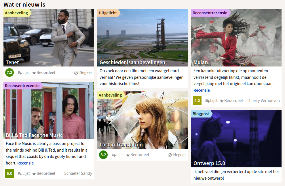
Twee pagina's kregen grote veranderingen, de thuispagina en de filmpagina's. Naast het toepassen van het nieuwe thema op de thuispagina, heb ik een sectie "Wat er nieuw is" toegevoegd om nieuwe blogposts, uitgelichte functies, nieuwe recensies en nieuwe aanbevelingen te tonen.
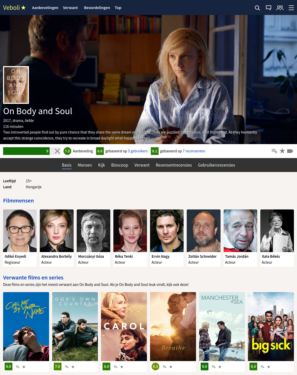
De filmpagina heeft nu makkelijk te navigeren subpagina's: basis, mensen, kijken, bioscoop, verwant, recensentrecensies en gebruikersrecensies. Hieronder zie je hoe dat eruitziet voor de geweldige film On Body and Soul.
I also removed the preview popup, you now go directly to the movie page when you click on the link.
Bekijk ook de post over ontwerp 14.0.
Wat is Veboli?
Veboli geeft persoonlijk filmadvies, zodat je makkelijk de juiste film kiest die bij je past. Lees meer
Lees meer over een abonnement
Lees de algemene voorwaarden


Heb je een vraag?
Stuur ons een bericht
Nederlands